
NYU Virtual Torch Tech
Collaboration Tool
Project Details
Virtual Torch Tech (VTT) is a knowledge and skill sharing platform developed to encourage IT members to collaborate towards having a better community. The purpose of this tool is to create a digital environment for NYU IT members to allow users to:
Share knowledge and skills.
Build connections.
Bring members in the community closer together.
Have a better understanding of what others do.
Role: User Researcher, Interaction Designer and Interface Designer
Tools: Sketch, Adobe Illustrator & Photoshop, Principle, Keynote
Type: NYU Employee
Project Length: 6 Months (July 2017 - December 2017)
Note: Part of the team till the first stage of design.
Design Process
Process Overview

In this project, I worked as a UX designer with a cross-functional team. When I joined, another designer in the team had already done the preliminary research to validate proto-persona. I used the research data and analyzed their needs through a rainbow sheet based on the results from the focus group session. Following this, I created the information architecture and wireframes to ensure users can access all the information they need. After this, I moved onto the first phase of design which included the main functionalities and conducting the usability tests for design iteration.
Challenges

No centralized platform to share info and collaborate with community members
Given that NYU has a big IT department, it uses different services to form groups and collaborate with others. For example, they used Google groups and Communities of Practice to create or join interested groups. They also used NYU Events to view details and would occasionally land on the website, NYU Torch Tech to learn more about other departments and its employees. However, the website was mostly static and had poor navigation.

Stakeholders with a diverse background
This project involved several stakeholders with diverse backgrounds, including graphic designers, librarians, administrators, politicians and so on.
Even though all of them worked at NYU, their perspectives were very different, and it was important to take this into account.
Problems

Analysis
NYU Torch Tech Website Heuristic Evaluation
The first step was to conduct a heuristic evaluation for the previous VTT website to understand the problems. One major issue plaguing the website is its lack of interactivity even when there isn't any significant traffic.


Communities of Practice (CoP)
Other than the VTT website, NYU facilitated CoP's to bring together members from the community who share the same interests and skills.
Even though they use a website to display the CoP information, the website is severely lacking in terms of interactivity; meaning users are unable to have discussions with other group members through the platform.
How might we encourage and empower professionals across NYU to network and collaborate with others based on shared interests and goals?
Problems:
Lack of interactivity with users. Only displaying information, and is not very engaging.
Unable to discuss with group members immediately.
User Personas
Based on the one-on-one interviews conducted with 6 people who worked at NYU IT, the user personas were divided into 2 groups - IT professionals and Non-IT professionals.
While both of them have different behaviors and goals, they have some similarities such as their interest in having a digital space to share or access tech-related knowledge and to have a platform to make networking easier.

Understanding Users’ Intentions
The first focus group sessions were conducted with the purpose to understand the users' motivations. Based on their feedback, their expectation and intentions were categorized into 4 categories:
Knowledge-sharing
Networking
Events
Projects
I introduced the rainbow sheet analysis method to the team to help them better understand the users' intentions.

Design Goals
We set up the primary design goals based on users' feedback. The general goal is to design an engaging, efficient, and easy-to-use collaborative knowledge-sharing and networking platform.

Knowledge-sharing and learning:
Ask questions and answer questions.
Share knowledge with others.
Networking:
Search people who have the required skills.
Participate in more events (upcoming or nearby events).
Connect with others online. (e.g., “Follow” on Twitter?)
Better and easier navigation:
Landing page with clear objectives and directions.
Responsive web User Interface.
Clearer menu tabs.
Main Features & structure
1. Information Architecture
Based on the rainbow sheet and evaluation of the previous website, my teammates and I identified five main features for:
Knowledge-sharing
Networking
Events
Projects
Community of Practice
We decided to have a landing page to introduce the platform to attract new users to the platform. Below is the information created for the website:

2. User Flow
To further define users’ actions, we created user flows for different features to gain a better understanding of how users will interact with it.

3. Wireframes
To better understand what kind of information users wanted to get from the platform, we user tested the wireframes on our stakeholders. Most of the pages were designed based on information architecture.
Challenges when creating wireframes:
Some of the problems we encountered at this stage were that users (in our focus group) were not familiar with wireframes and wanted to see more colors in the components which represented the NYU branding. Following this stage, we confirmed the information on the wireframes before moving onto the next step - Hi-Fi prototypes.

Hi-Fi Design
1. Color Palette for VTT
Considering this project is related to technology, users wanted to see a website design which was "young and energetic," so we decided against using the traditional NYU violet in this phase. I created and defined the color palette for the website. For the next stage, we planned to have a detailed visual guideline.

2. Accessibility
While designing the system we kept accessibility in mind to ensure that all the colors met the WCAG 2.0 AA standards.

Illustrations for Landing Page
One of the feedback we received after we tested the wireframes for the landing page wireframes was that the text and icons appeared to be very dull and were not engaging enough for the users. To make it more dynamic and youthful, we tried to present our product feature more creatively. I decided to create illustrations to tell more about the features, i.e. including knowledge-sharing, events, projects, and networking.
As the primary purpose of this platform is to "bring NYU IT together," for all the illustrations I showed at least 2 people collaborating. Also, the sketches were inclusive of University and IT priorities: Diversity and Women in IT.

Usability Testing
1. Focus group and presentation with CIO/VP
At this stage, my team and I conducted focus groups for usability testing and to learn more about user needs. We also had a meeting with the CIO and development team to understand their perspective and techniques better. As a moderator in the focus group session, this was an excellent opportunity for me to share the design with the community and to speak with them in person.

Design Iterations
Using the feedback from the focus groups, we iterated our designs. Below is a look at some of the changes we made:
1. Landing Page


2. Home Page (Knowledge Sharing)

3. Community of Practice

4. Events

Application Interfaces
Following the usability testing, we improved the designs based on user feedback. For example, we added NYU violet to the color palette. We also curated posts/ questions according to the interests selected by the user.
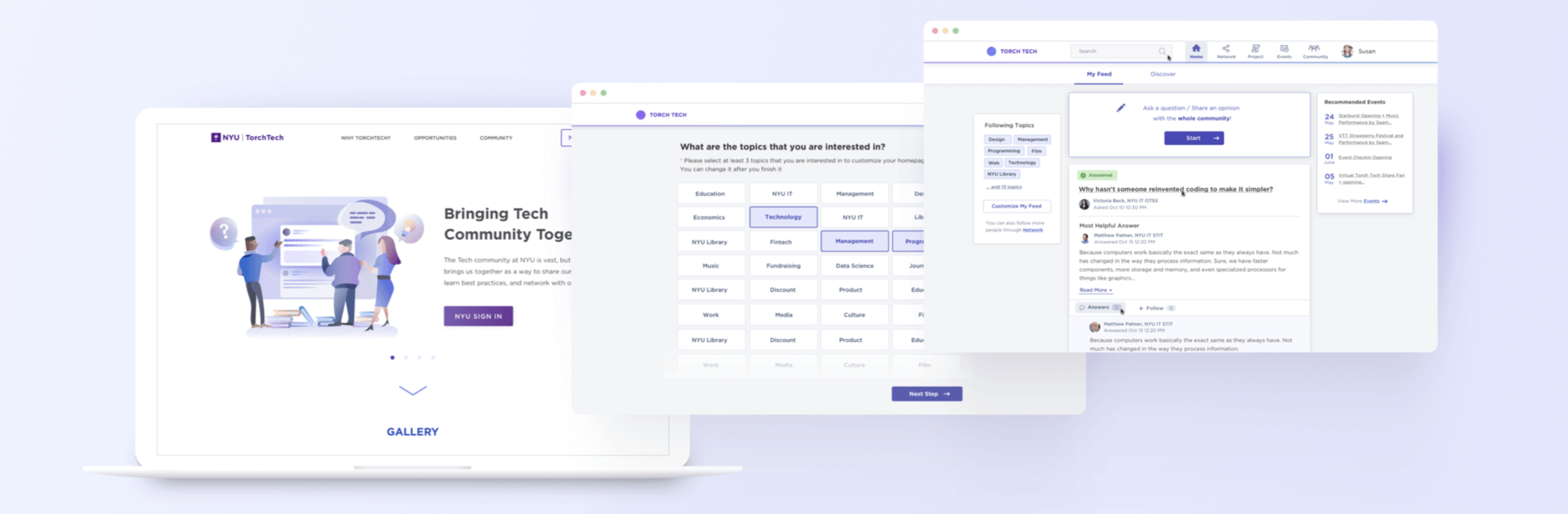
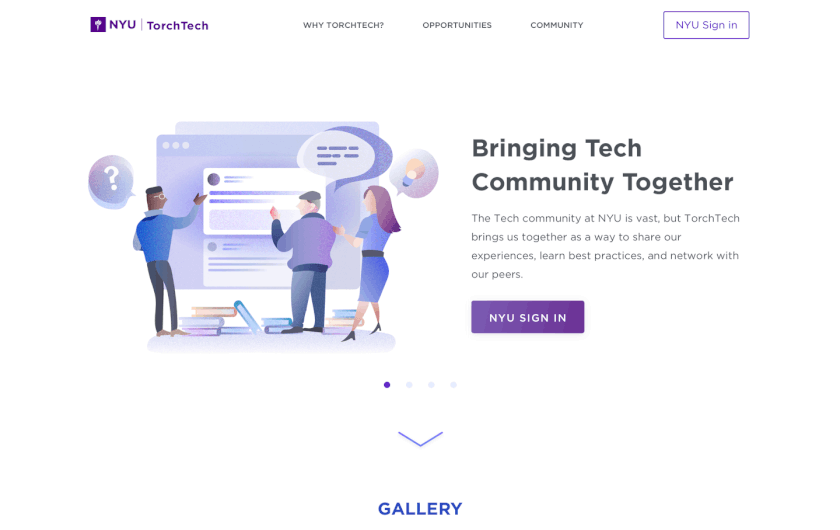
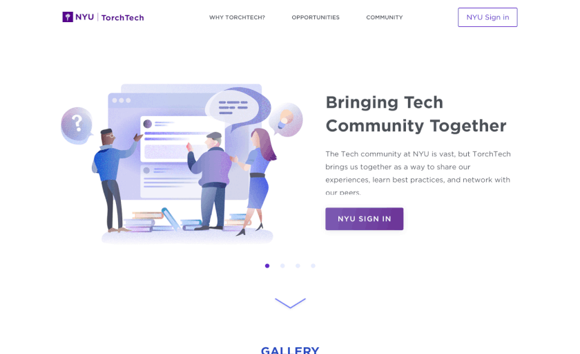
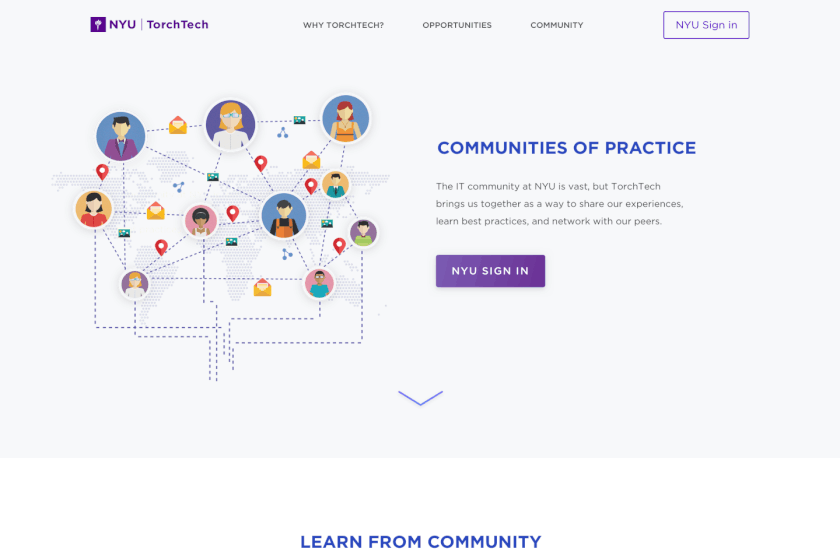
1. Landing Page
We created a landing page to showcase the purpose of VTT and its features. I made illustrations to make the platform more creative and explain its main features. We also provided photos in the second section to make users feel more connected and engaged with the community.
2. Customize interests if first time logging in
Based on the findings in the focus group session, we discovered that our users were interested in customizing their home page based on their interests. So I designed an onboarding process for them to choose the topics they are interested in and connect with people they know.

3. Knowledge-sharing - Home Page
The primary purpose of this platform is to encourage knowledge sharing and a collaborative environment. We had a more visual focus for the writing post section, which would help users share knowledge. If they are a first time user, the system would guide them on how to ask a question or post an article. Users can also customize their interest by clicking the left-side menu. They can also see the latest events on the right side menu. If they are interested in a question or an article, they can click the title to learn more. We have also provided a “Discover” feature for users to explore more posts or questions out of their original interest.


4. Community of Practice(CoP)
As Community of Practice(CoP) is an essential feature of VTT, we decide to briefly provide CoP details in the Landing page (external website). Users can choose to view all CoPs, trending or recent CoPs. After they log in to the system, they can read more information regarding each community including their members and community details. If they join the CoP, they can view all resources, members, and posts. They can also create their own CoPs.
I. External CoP

II. Internal CoP

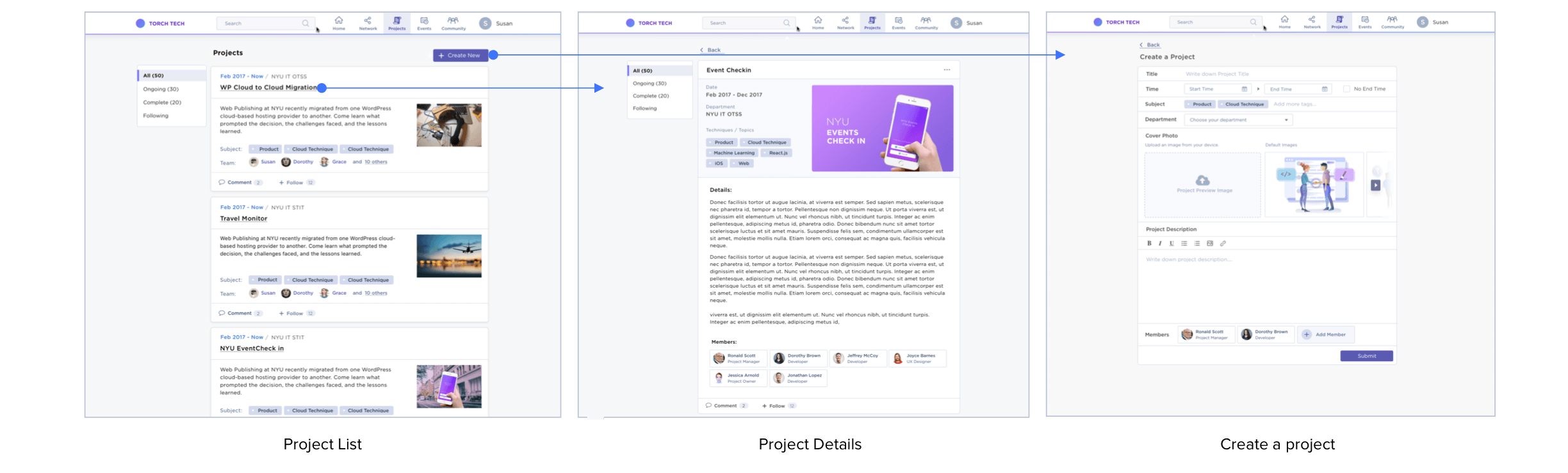
5. Project Page
As many people in the IT community are interested in what others do, we have added a feature to allow them to view the projects of other workers. They can see information like project details, members and techniques which would help them know who they can reach out to if they face any problems using similar methods. Users can also create their project and share it with the community.
6. Event Page
Based on our research, we discovered many people were interested in participating in events. This would allow them to network with other users and also share knowledge with others in person. Users can filter the events by different attributes:
Upcoming events
Location
Popularity
Past events
I also provided a small calendar under the filter section which would help users know when the events would happen.

Next Steps
1. First Phase Development
Since development takes more time we decided to launch the MVP first, which included the knowledge-sharing, search, and profile features.
2. Networking Page & Mobile Version of the Design
When I left the project following graduation, the project was not yet finished. With the majority of the users using mobiles to browse knowledge-sharing platforms, creating a mobile version of the designs became a top priority. We also aimed to finish the designs for the networking feature as they were an essential feature of the entire experience.
3. Make a Complete Design Guideline
Since two designers quickly developed this project, we did not build a holistic visual system in the first stage. To make it easier to create for developers, we decide to build a complete guideline as part of the next step.

Ending Thoughts
1. Think from different users’ perspectives. Explain more to deliver the idea.
When we conducted usability testing (also known as focus groups), we noticed some non-IT professionals were unable to understand our idea. They were not even aware of what a "landing page" is. This entire process made me more empathetic and taught me how to explain my designs without using technical jargons if I am explaining to a new user or someone who is unaware of the technology.
2. Don’t be afraid of being criticized
This project provided me with the opportunity to speak with the users in person. While the majority of the feedback was insightful, some users had a tendency to be very critical.
One of the users went as far as to say, "I don’t like the design, and it appears disconnected to me." While I was initially taken aback by such criticism, I enquired as to what made him feel detached with the design. Some of the feedback I received following this was extremely insightful and helped in the final design iteration.